Brand Refresh / 2021
Kit Undergarments
Brand Refresh
A refined brand system for Kit Undergarments, built to preserve its editorial softness while scaling across campaign, marketing, and commerce touchpoints.

- Client
- Kit Undergarments
- Focus
- Brand Refresh
- Role
- Brand Design • Creative Strategy • Visual Systems • Digital Extension
- Output
- Visual Identity • Brand Applications • Commerce Extension
02 / Challenge
Challenge
Kit needed a refreshed identity that could feel more elevated and scalable without losing the softness, intimacy, and editorial tone that made the brand distinct.
Opportunity
Clarify Kit's visual point of view after acquisition and create a system that could support campaign storytelling, digital marketing, and commerce without becoming generic.
My Role
Led brand design and creative strategy across the refresh, defining the visual language and extending it into customer-facing applications.
03 / Strategy
Brand Refresh Strategy
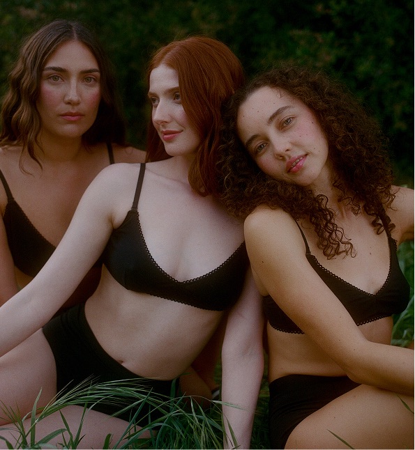
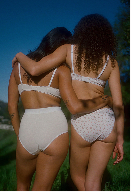
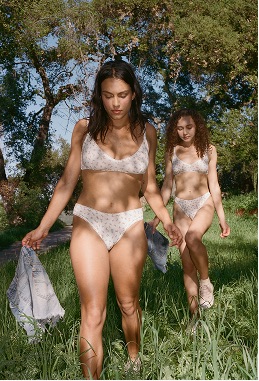
The refresh centered on a softer premium language: editorial, feminine, consistent, and flexible enough to move across brand and commerce moments.
04 / Identity
Visual Identity System
A restrained identity system built from blush, sand, softened contrast, editorial typography, and product-forward art direction.
#FFF1F1
#EFDAC8
#514D51
#F4F4F4
Accessibility + Channel Logic
Defined soft but legible color pairings, then let the typography appear through application: familiar email patterns for recognition in the inbox and Kit's more editorial voice across brand-led shopping moments.






05 / Applications
Brand Applications
The refreshed identity scales into email and launch marketing touchpoints, translating Kit's editorial softness into customer-facing brand moments.
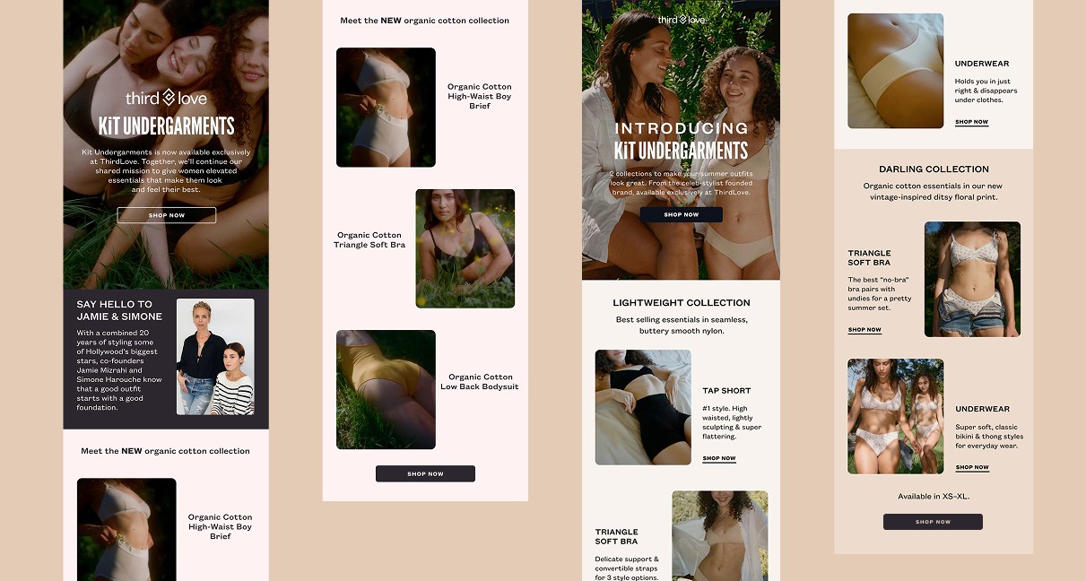
Email Launch System
Used the refresh to shape a launch email system that carried Kit's editorial tone into ThirdLove's customer communications while keeping the brand polished, legible, and consistent.
View the email mockup ↗06 / Commerce
Brand System in Commerce
The refreshed identity extends seamlessly into commerce, maintaining Kit's editorial tone while creating a cohesive shopping experience across responsive touchpoints.

Commerce Extension
Website touchpoints show the refreshed identity moving into commerce with the same editorial tone, pairing desktop and mobile views as one connected brand system.
View the website mockup ↗07 / Outcome
Outcome
The refresh gave Kit a clearer, more scalable visual foundation for brand storytelling, marketing, and commerce extension.
Clarified Kit's visual position through a softer, more editorial identity system.
Extended color, typography, photography, and layout principles across campaign and marketing applications.
Demonstrated how the brand system could live inside responsive shopping touchpoints while keeping the refresh as the central story.
Reflection
This project demonstrates how a brand refresh becomes stronger when it is treated as a system, not a surface change. The most important decisions were about restraint: preserving Kit's softness, tightening its visual consistency, and proving the identity could scale without losing its editorial sensibility.