Mobile UX/UI / 2020
Fenty Beauty
Mobile UX/UI Strategy
A brand-driven mobile experience that makes finding your shade effortless, pairing intuitive UX with unmistakably Fenty storytelling.
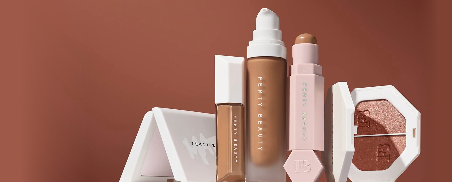
- Client
- Fenty Beauty
- Focus
- Mobile UX/UI + Visual Design
- Role
- UX/UI Design • Visual Design • Creative Strategy • Prototyping
- Output
- Shade Quiz • Get the Look • PDP System • Prototypes
02 / Challenge
Challenge
Fenty already owned a bold, inclusive voice. The task was extending it into a mobile-native journey that felt personal, shoppable, and educational rather than transactional.
Opportunity
Complexion discovery is where beauty shoppers stall. The opportunity was to make finding a match feel like guidance from the brand, filtering by skin goals instead of product specs so no answer ever becomes a dead end.
My Role
Designed the UX/UI, visual design, and creative strategy end-to-end, translating Rihanna's conversational tone into flows, an inclusive visual system, and interactive prototypes. What began as a self-directed concept grew into a client engagement with Fenty Beauty.
03 / Strategy
Experience Strategy
The experience leads with skin goals, keeps the brand voice in the microcopy, and treats inclusivity as a design principle rather than a marketing claim.
04 / Visual Language
Visual Language
An inclusive, accessible language: warm complexion-inspired tones held against high-contrast black and white, set in a clean Helvetica system that keeps the brand bold and legible.
#C6AAA4
#E8C0A8
#000000
#FFFFFF
Rationale
Complexion-inspired tones make the palette feel like the customer, while ADA-compliant contrast keeps typography legible. One clean type system does the structural work so Fenty's voice can lead in the copy.
05 / Shade Quiz
Shade Quiz Experience
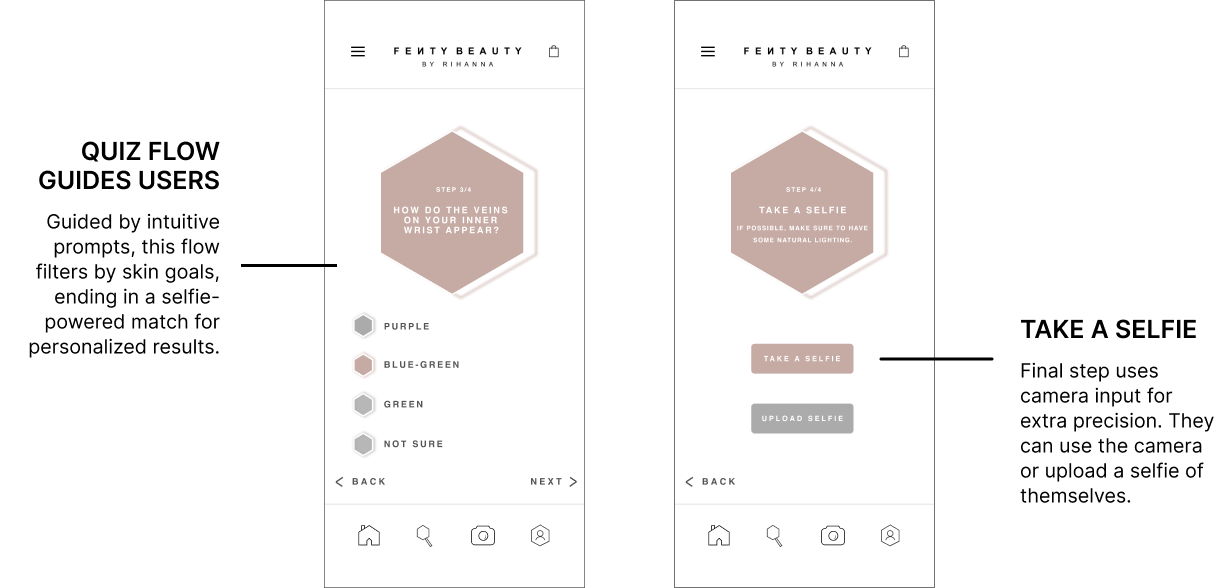
The quiz leads with how skin behaves, undertone checked against wrist veins, then a selfie to fine-tune, so an uncertain answer still moves the journey forward.
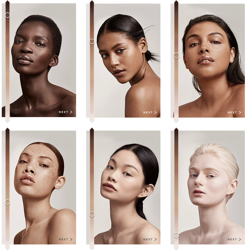
Undertone Visual Selector
An inclusive skin-model reference guides match accuracy and keeps the language visual, not clinical.
Beyond the Quiz
Get the Look
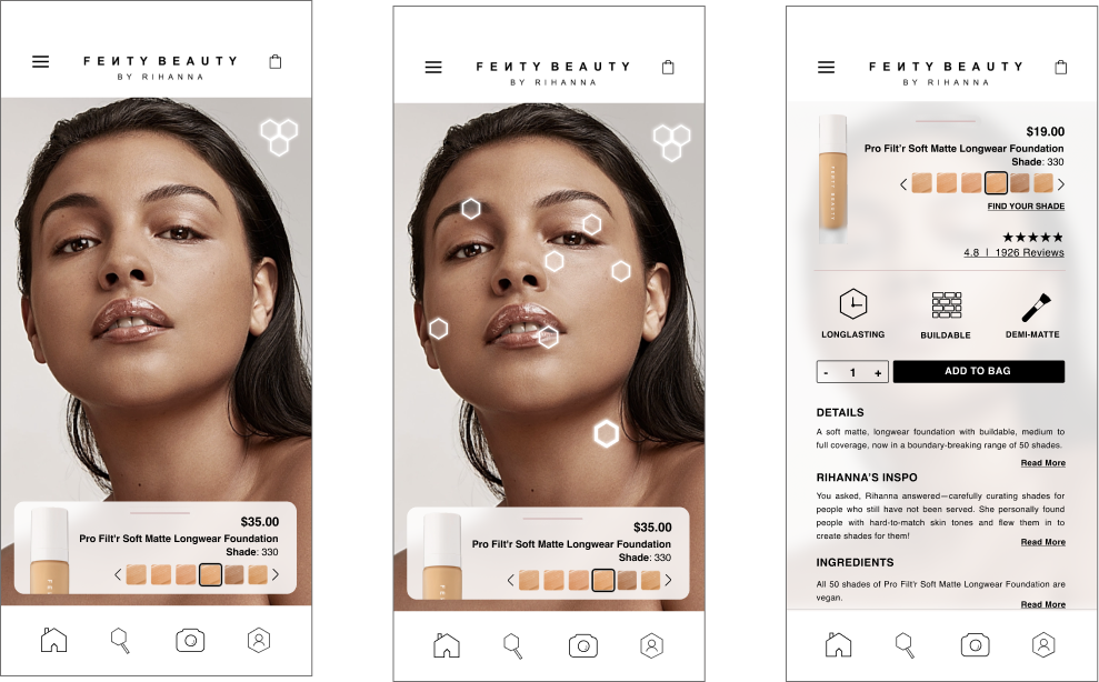
The shade logic extends onto real models. Tap a model to see exactly what she's wearing, then shop her match.
How It Works
Tap a model and the magnetic Fentystick honeycomb icons glow in the upper corner, then pin to each part of her face (brows, eyes, concealer, blush, lips, contour) so nothing is a guess. Tap one, say the foundation, and its exact shade surfaces (Pro Filt'r 330) with details and add-to-bag, turning "she looks like me" into a shoppable match.
06 / Prototypes
Interactive Prototypes
Three flows show the refined mobile UX in motion, from first impression, into the Fenty Finder quiz, through to results that are easy to act on.


07 / Outcome
Outcome
A mobile-first experience that does not just look like Fenty, but feels like Fenty, turning emotion into conversion while honoring inclusivity and scale.
Extended Rihanna's voice into flows, microcopy, and interactions instead of surface styling.
Skin-goal logic and diverse references made match accuracy feel personal to every user.
Removing dead ends turned discovery into a confident, shoppable decision.
Reflection
This project reinforced how much a strong identity can direct behavior, not just decorate it. By centering education, inclusivity, and confidence in the mobile experience, I learned to let brand values guide the flow itself, translating a bold, empowering voice into a journey that feels personal, expressive, and scalable for mobile-first audiences.