Product Discovery UX / 2020
Everlane
Product Discovery UX
A mobile-first experience that reimagines Everlane's product discovery and checkout while honoring its ethos of transparency, simplicity, and intentional consumption.

- Type
- Self-Directed UX/UI Concept
- Focus
- Mobile UX/UI + Product Discovery
- Role
- UX/UI Design • Product Design • Creative Strategy • Prototyping
- Output
- Discovery Flow • Checkout • UI Refinement • Prototypes
02 / Challenge
Challenge
Everlane's voice is built on transparency and clean, ethical design, but its mobile experience lacked the guidance to move a browser toward a confident purchase.
Opportunity
Treat "radical transparency" as an interaction model, not a tagline. Test whether pricing honesty and sourcing detail could be built into the UI itself rather than stated in marketing copy alone.
My Role
Designed the full UX/UI and creative strategy end-to-end. An independent concept translating Everlane's values into microcopy, a mindful filter quiz, and brand-anchored UI details like True Cost and Know the Factory.
03 / Strategy
Experience Strategy
The flow front-loads cost transparency, social proof, and material honesty before the ask to buy, a calm, trust-first sequence aligned with Everlane's brand thesis.
04 / Visual Language
Visual Language
A restrained, editorial language: a neutral grey system and transparency-inspired overlays, generous white space, and a Helvetica-and-Athelas pairing that keeps content, not UI, in front.
#FFFFFF
#949698
#4C4C4B
Rationale
The neutral system and generous white space create a distraction-free surface, ADA-compliant contrast keeps everything legible, and an editorial serif for product titles balances storytelling with utility so browsing never competes with the product.
05 / Discovery
Design Decisions, Brand-Driven
Every touchpoint upholds Everlane's principled approach, so a price-conscious shopper meets cost transparency, sourcing detail, and reviews before any push to buy.
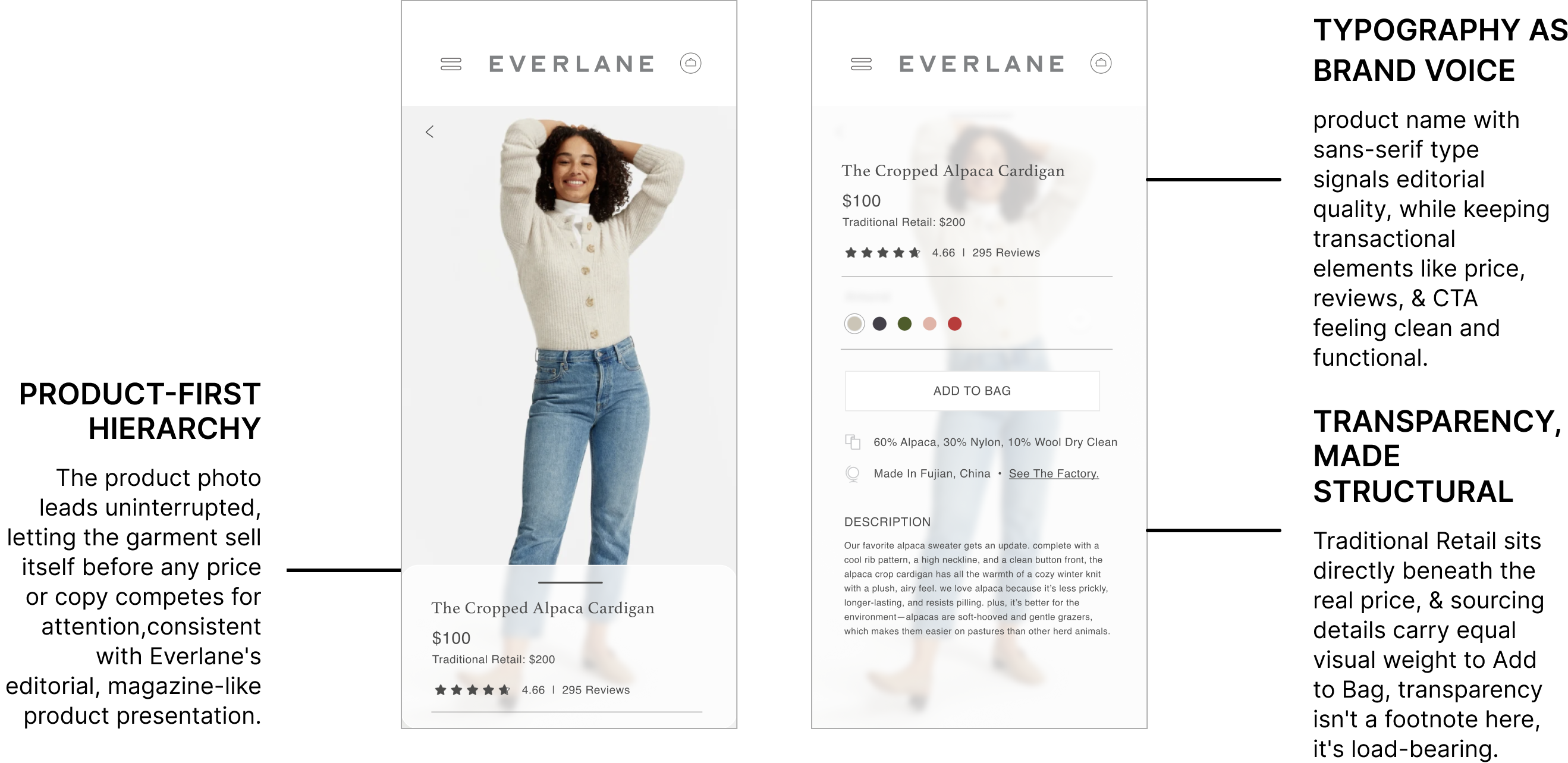
Built to Convert Price-Conscious Shoppers
The flow makes ethical claims visible moments in the UI rather than marketing copy, turning transparency into a reason to buy.
06 / Prototypes
Interactive Prototypes
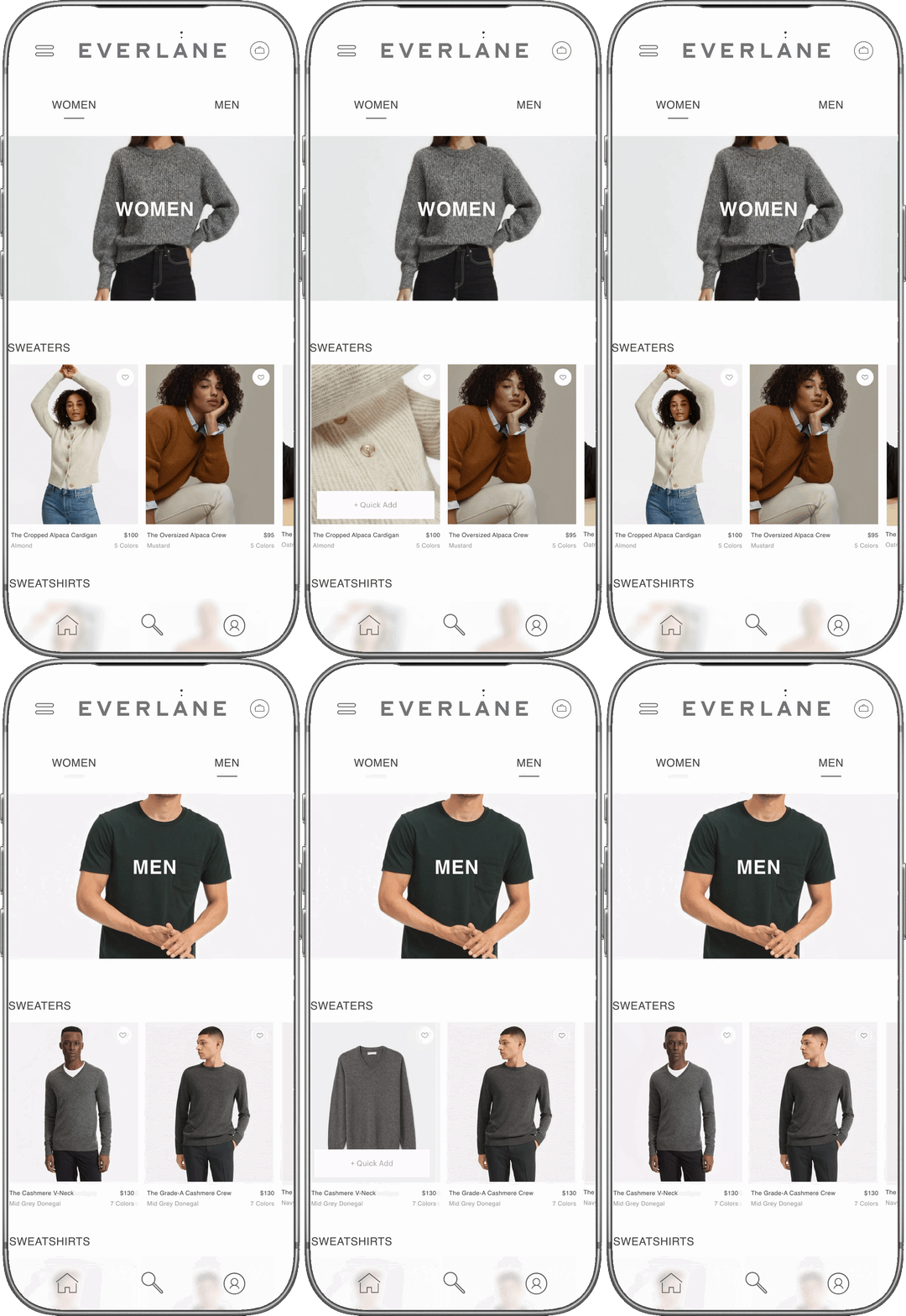
Three flows show the refined mobile UX in motion: calm, intentional, and unmistakably Everlane, from first impression to product detail. Real pricing context, sourcing detail, and reviews surface before the ask, and navigation stays flat and photo-forward, so trust-building leads the sequence instead of trailing it.

07 / Outcome
Outcome
A flow where Everlane's values are experienced, not just stated, and restraint does the heavy lifting.
Built True Cost and sourcing detail into the interface as trust-building moments.
Flat, photo-forward navigation let content lead and kept browsing distraction-free.
Sequencing proof before the ask turned mindful browsing into confident purchase.
Reflection
Designing around an already-strong brand voice taught me restraint as its own discipline. The hardest edits were the ones that cut UI flourishes competing with content Everlane had already earned the right to say plainly, proving that the best interface can be the one you barely notice.