
Strategy + Creative Role
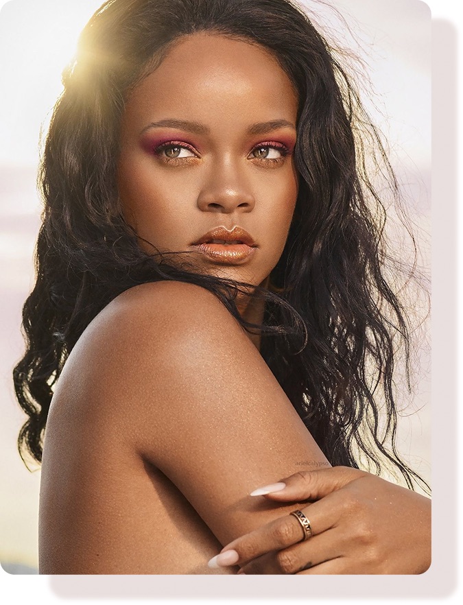
Fenty already had a distinct brand identity: inclusive, edgy, and empowering. My role was extending that voice into a mobile-native journey, one that felt personal, shoppable, and educational rather than transactional. I built the experience around Rihanna's conversational tone, an inclusive visual identity carried through diverse models and the "Get the Look" feature, and a mobile-first quiz that filters by skin goals instead of product specs.
Skin Quiz Experience
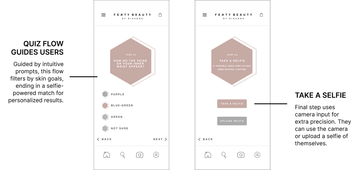
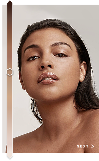
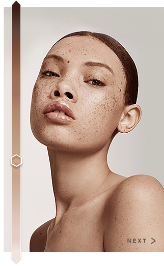
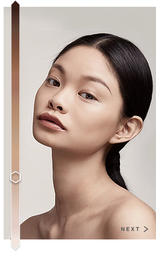
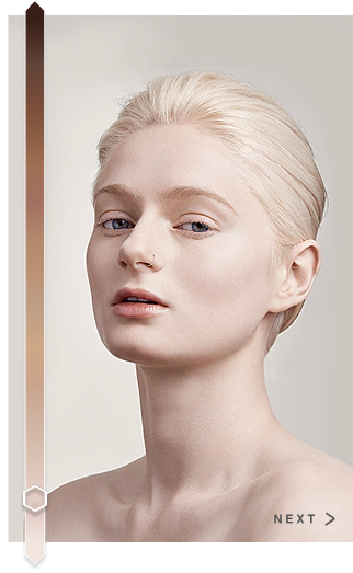
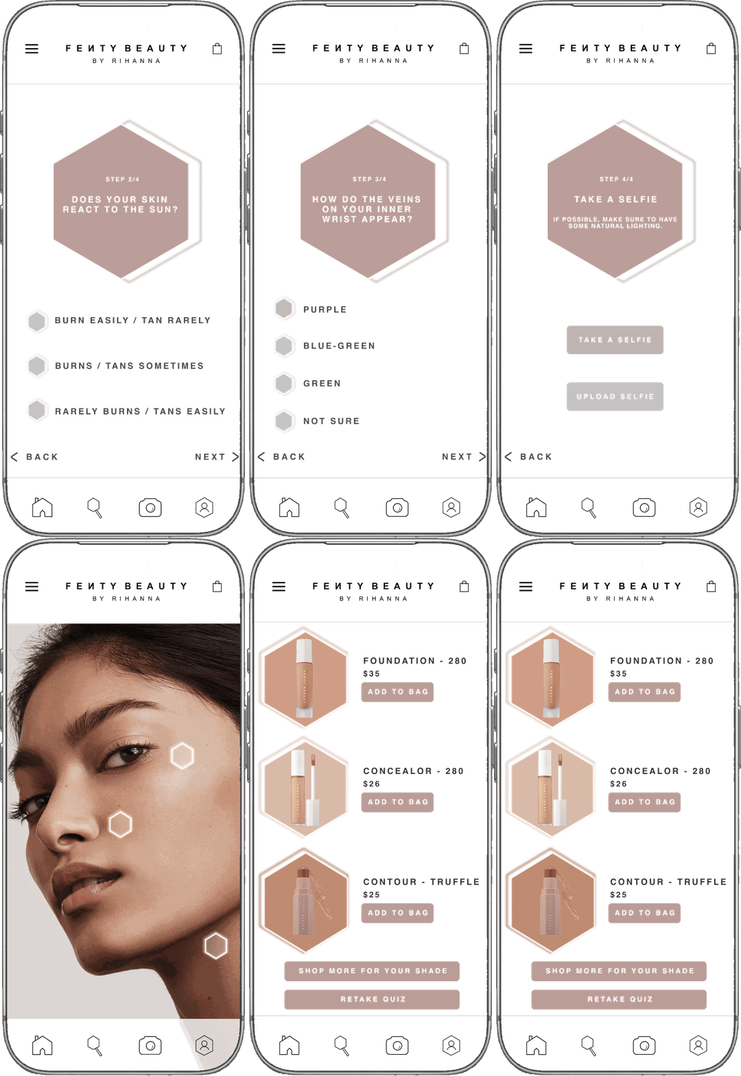
To help Gen Z users find their match, the quiz leads with skin goals and intuitive prompts before product specs: how skin reacts to sun exposure, undertone checked against wrist vein color, and a selfie to fine-tune the suggestion. Uncertain answers still move the journey forward, so a "not sure" never becomes a dead end. The logic mirrors Fenty's inclusive, science-backed ethos, guiding users rather than testing them.
Undertone Visual Selector
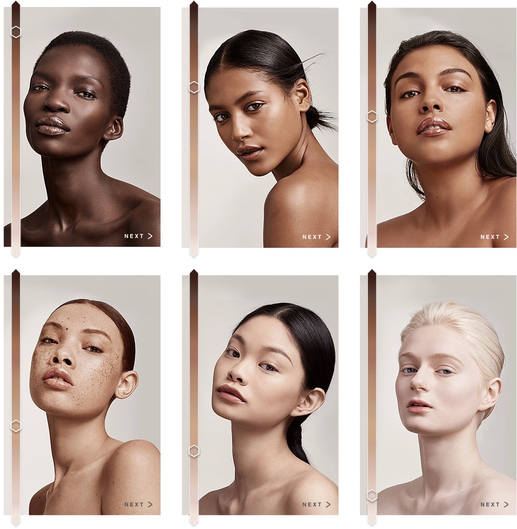
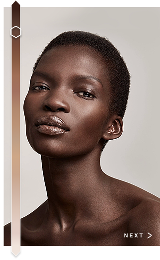
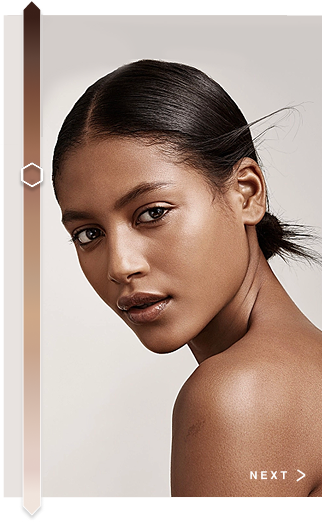
Inclusive skin model reference to help guide match accuracy
Visual Identity System
UI built with accessibility in mind, using high-contrast layouts. Integration of core brand colors (rose-gold, espresso, soft neutrals) into functional elements. "Get the Look" component brings editorial meets e-comm energy to the mobile shop flow.
Introduced ADA-compliant color pairings, blending rich skin tones and vibrant accents to preserve high-contrast typography while amplifying Fenty's bold, inclusive, and unapologetically expressive brand presence.
Typography
abcdefghijklm nopqrstuvwxyz
0123456789
abcdefghijklm nopqrstuvwxyz
0123456789
Brand Meets Experience
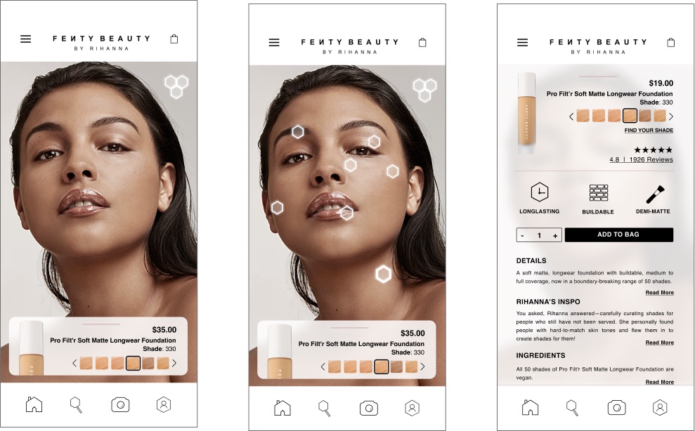
This design translates Fenty's inclusive voice into every interaction. The result is a mobile-first experience that feels intuitive, personalized, and unmistakably brand-forward.
Typography Choices
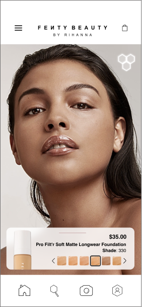
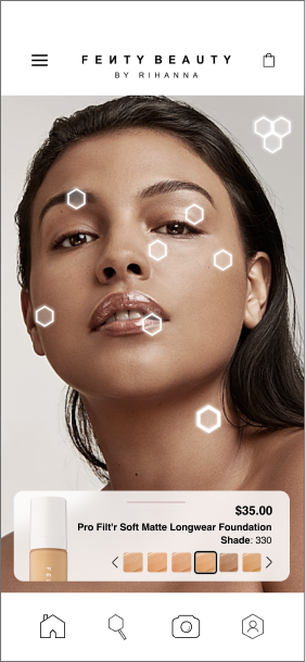
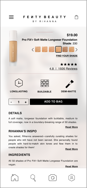
This screen closes the loop, translating quiz logic into easy-to-act-on results from shade names to finish breakdowns and product add-ons.
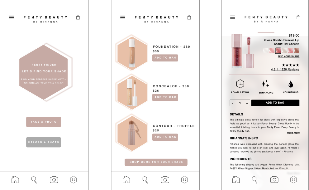
Interactive Prototypes & Final Design Screens
Showcases the refined mobile UX designed to feel intuitive, inviting, and unmistakably Fenty.
Homepage
- Hero introduces product storytelling
- Icon-based nav simplifies browsing
- Designed for quick access to trending or personalized picks
Sets Tone and Invites Discovery
Clear Pathway Into Quiz, Minimal UI
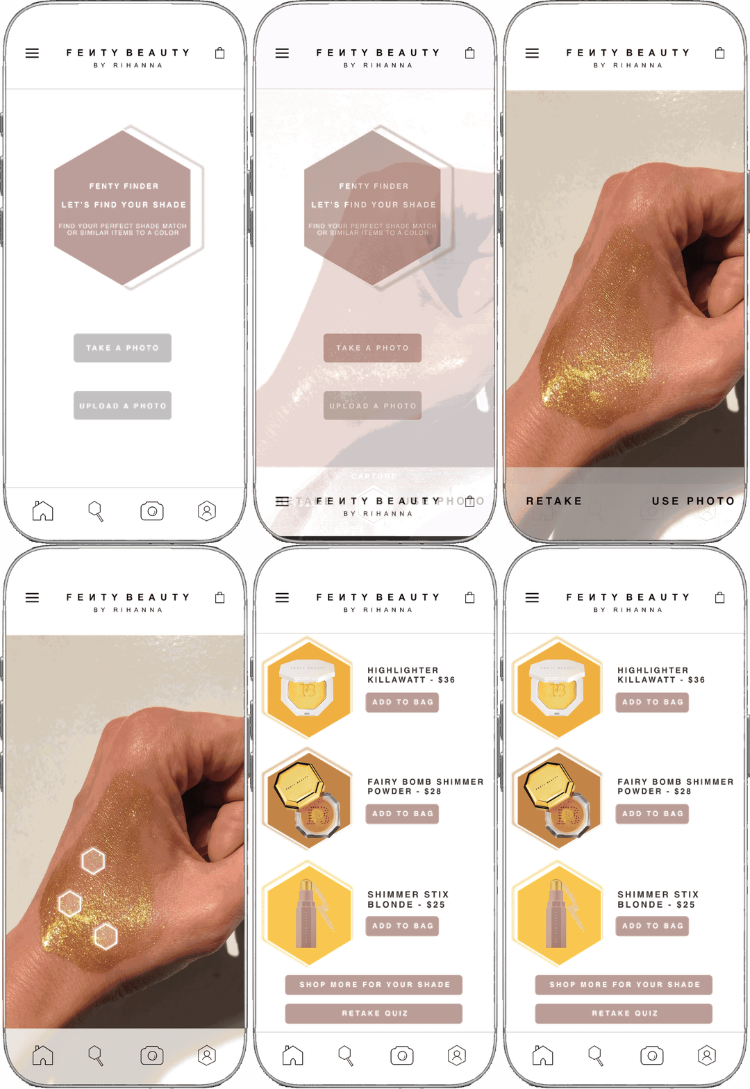
Fenty Finder
- Clear CTA guides users into the quiz
- Minimal UI helps emphasize user choice
- Custom-toned color palette aligns with brand's inclusive range
Shade Finder Quiz Flow
- Sequential flow mimics natural user logic
- Skin tone filters and undertone reference ensure accurate matches
- Optimized for both quick-tap decisions and in-depth users
Intuitive Logic With Visual-Driven Prompts
Results
This project brought brand storytelling and UX strategy into sync, crafting a digital experience that didn't just look like Fenty, but felt like Fenty. The process sharpened my ability to build intuitive, mobile-first journeys that translate emotion into conversion, while honoring inclusivity, identity, and scale.
Reflection
This project reinforced the importance of designing around an established identity. By centering education, inclusivity, and confidence within the mobile experience, I learned how brand values can actively guide user behavior rather than simply frame it. Translating Fenty's bold, empowering identity into intuitive flows sharpened my ability to design experiences that feel personal, expressive, and scalable, especially for mobile-first audiences.