
Strategy + Creative Role
Everlane's brand voice is built on transparency and clean, ethical design, but their mobile experience lacked the guidance to move a browser toward a purchase. I translated those values into interaction design: honest, no-fluff microcopy; a mobile-first filter quiz for mindful discovery by price and material; and brand-anchored UI details like 'Know the Factory' and 'True Cost' tags that turn ethical claims into visible moments, not just marketing copy.
Brand + Experience
Instead of purely functional screens, I treated every touchpoint as an opportunity to uphold Everlane's principled approach. Clean typography, thoughtful pacing, whitespace, and educational cues (e.g., ethical info, sustainability badges) were considered brand moments, not just UI details.
Visual Identity System
The UI is built on Everlane's restrained, editorial aesthetic: clear, accessible layouts with generous white space, their neutral color system carried into functional UI elements for a calm, distraction-free experience, and product presentation that balances storytelling with utility to reinforce trust throughout the mobile flow.
Introduced ADA-compliant color pairings, applying Everlane's core palette with transparency-inspired overlays to maintain high-contrast typography while reinforcing the brand's minimalist, principled design ethos.
Typography
abcdefghijklm nopqrstuvwxyz
0123456789
abcdefghijklm nopqrstuvwxyz
0123456789
abcdefghijklm nopqrstuvwxyz
0123456789
Design Decisions, Brand-Driven:
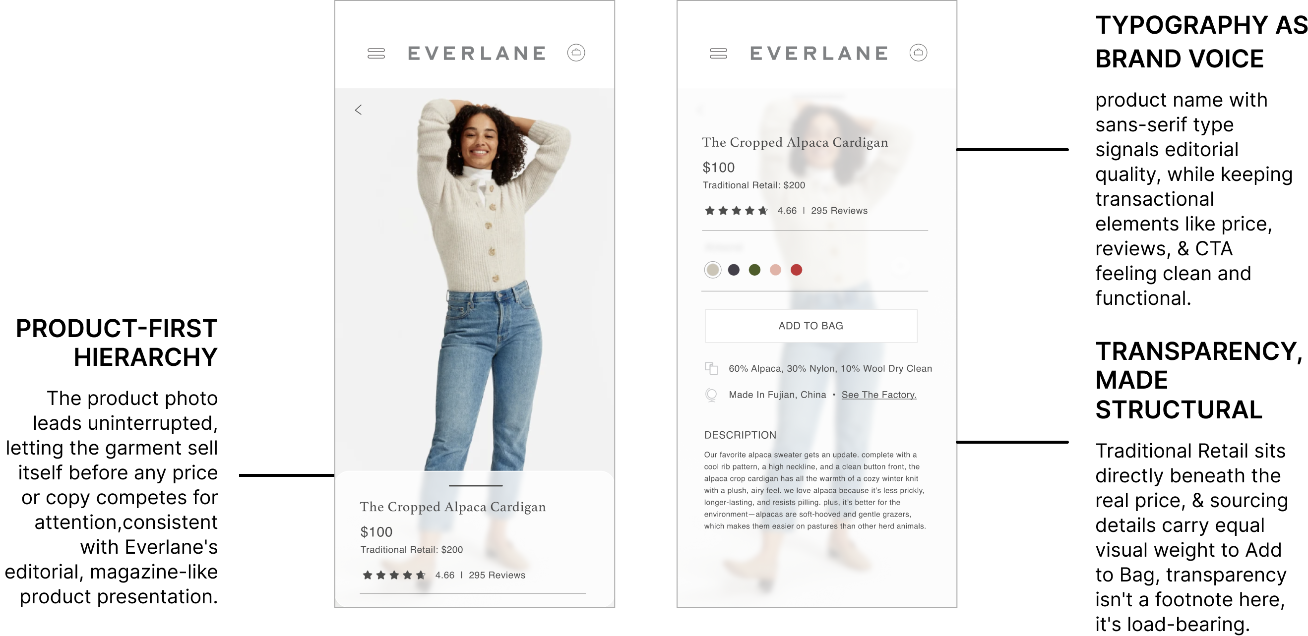
Built to Convert Price-Conscious Shoppers
The flow front-loads cost transparency, social proof, and material honesty before asking for the sale, a calm, trust-first sequence aligned with Everlane's brand thesis, not just a UX best practice.
Interactive Prototypes & Final Design Screens
Showcases the refined mobile UX designed to feel calm, intentional, and unmistakably Everlane.
Homepage
Clean entry point that sets a calm, intentional browsing environment aligned with Everlane's minimalist brand.

Onboarding Experience
Product Discovery
Streamlined category navigation designed for fast browsing.
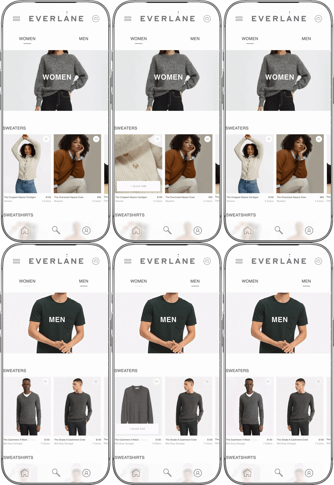
Intuitive Browsing Without Visual Noise
Product Detail Screen
Balances transparent product information with clear calls to action, reinforcing trust and ease of decision-making.
Intuitive Logic With Visual-Driven Prompts
This project treats Everlane's 'radical transparency' as an interaction model, not just a tagline: testing whether pricing honesty and sourcing detail could be built into the UI itself, rather than stated in marketing copy alone.

Results
The result is a flow where trust-building comes first: real pricing context, sourcing detail, and reviews all surface before the ask to buy. Category navigation stays flat and photo-forward, so browsing never competes with the product for attention.
Reflection
Designing around an already-strong brand voice taught me restraint as its own discipline: the hardest edits here were the ones that cut UI flourishes competing with content Everlane had already earned the right to say plainly.